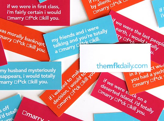
You may know it as Marry, Murder, F*ck or Marry, F*ck or Kill. Either way, the addictive game of determining which, from three members of the opposite sex, you'd like to make love, make a lifetime commitment or simply eradicate from earth has been turned into a well-designed and clever online site and shop.
Advertising copywriter Thom Cordner and Art Director Amanda Mourenza pooled their sick sense of humor and their smart sense of style to design The MFK Daily (and the goodies that go with it). An appealing looking, easy to navigate website featuring the MFK game for both male and female players - straight, gay or otherwise - with seemingly endless options.
The clever trios, from which you are to choose, are grouped by everything from such general categories as Athletes and Politicians to as specific as your favorite Irish actors or the same actress in three different roles.
Not only can you play the game, but as soon as you've chosen, you can see where your own tastes lie in comparison with others who play:
Not big on online game playing? Do not fret, they sell well-designed hilarious card versions of the game that also do double duty as flirtational devices when left, boxes checked, at the proper places - or in the proper hands.
MFK Daily Cards: There are over twenty different 1" x 2.5" cards and more to come.
Colorful neon flocked appliques of the game name or icons are available on various colored shirts for both men and women: T-shirts in which you can tick off any box or none at all: And other fun MFK Daily tees in men's or women's styles with lots of color options: And black or white women's undies:
Thom & Amanda Thom Cordner and Amanda Mourenza are freelance creatives who combine smart strategic thinking with well-executed work. You can see more of their talents, or book them if they are available, at their websites:
This has got to be one of the most beautiful ads I've ever seen. This award-winning two minute video -and its web counterpart- for Sapporo Beer combines live action with animation to tell the story of the brand and brewing history of the Japanese beer.
Created by Dentsu, Canada in 2010, the two minute spot was co-directed by Mark Zibert of Sons and Daughters and Gary Thomas of Crush. It took over a month to shoot this creative film on location in Guangzhou, China.
“We looked at a few techniques off the top,” says Zibert. “We first considering creating the entire spot with motion control and CG. Then experimenting with projecting 2D art/matt paintings onto geometry (developed by Crush Sean Cochrane) and finding it had a unique quality to make this campaign stand apart. So the spot is not entirely photo or CG or 2D illustration, but a combination of all three,” adds Zibert.
a few screen grabs of the spot so you can see some of the beautiful imagery:
The video has also been edited down for a series of 15-second TV commercials, as well as a 60-second spot.
“We wanted something distinctly Sapporo and wanted to go through the heritage and the brewing process and combine the Japanese flavour but take it beyond sushi and make it mainstream,” said Glen Hunt, creative catalyst, Dentsu Canada.
The campaign is the first full-scale national effort in Canada and the first of any sort for the Toronto-based agency since taking the account over in January 2009. Sleeman had not worked with a full-service agency since 2007, when Doug (now Doug & Serge) held agency of record status.
The campaign took one and a half years of planning, and six months to shoot. The agency developed five distinct campaign ideas before narrowing it down to three, which were presented to the client, said Hunt.
“Each one of them had a wonderful response [but] ‘Legendary’ was their favourite,” he said.
Parts of the ad were shot in China in front of a green screen, and then brought back to Toronto where each shot was placed in position on a “map painting” and given a “3D type effect so that it created depth,” said Hunt.
Dentsu also assisted Concrete in the design of a new 500 ml can that features Japanese script meaning “premium” and the historic Sapporo “north” star embossed on the front.
“We know our consumers not only demand a high quality product, but also a brand that conveys attributes that appeal to their individuality,” said Kenny Sadai, president and CEO of Sleeman Breweries, in a release. “We felt tapping into the brand’s Japanese heritage and bringing to life the essence of ‘Biru’ would further illustrate those qualities.”
THE INTERACTIVE WEBSITE
Sapporo launched a microsite with a contest that asked consumers to locate the hidden scrolls placed throughout the video for a chance at a trip to Japan. The trip has already been awarded but you can still play the game and explore the site to find the hidden 'scrolls'.
Working with Dentsu, Lollipop created the site to support the launch of the Legendary Biru campaign for Sapporo Beer.
The site itself is centered on a character – the Sage – that is the keeper of the legend of Sapporo. He leads visitors on a ‘treasure hunt’ through the site where the goal is to collect a number of hidden scrolls. Some are easy to find and tell a brief story about the beer, while others are well hidden and require diligence to unlock. Those who reach the end of the journey are given a message tailored to the number of scrolls they’ve discovered, while those who manage to collect all 15 scrolls are entered to win a trip to Japan.
Lollipop designed and built the site, in addition to shooting the sage video. Sons & Daughters shot the live action, while Crush created the CG, mattes and final compositing.
Sons & Daughters and Crush managed production, Lollipop was responsible for the interactive, and Grayson Matthews created the music featured in the spot.
Credits: Title: "Legendary Biru" Agency: Dentsu Canada, Inc. City: Toronto Campaign: Legendary Biru Advertiser: Sapporo Breweries Ltd. Brand: Sapporo Type: Television Length: 120 seconds Market: Canada Creative Director: Mr. Glen Hunt Creative Director: Les Soos Art Director: Les Soos Art Director: Mr. David Glen Copywriter: Mr. Dhaval Bhatt Copywriter: Mr. Glen Hunt Director: Mr. Mark Zibert Director: Mr. Gary Thomas Production Company: Sons & Daughters Production Company: Crush Account Director: Mr. Tim Binkley Agency Producer: Ms. Sharon Kosokowsky Post Production: Crush Music Company / Composer: Grayson Matthews
Information, text and images courtesy of Creativity-Online, Sapporo, Lollipop and Adland Special thanks to Thom Cordner for bringing the spot to my attention.
The other day, I came across an online manufacturer's site that was beautifully done.
Aster de Villatte is a manufacturer of tabletop and home accents that is carried in high end boutiques all over the world. Although you can't order direct from their site, you can browse their interactive catalog and locate many stores that carry their products.
But that's not the point of this post. The point is how much fun you'll have looking for those stores, and at their objects, because of the unique interactive presentation of their wares.
In their online catalog, not only is each page a new mystery (click around and find info) but each is photographed beautifully and the animation is pretty darn seamless.
When clicking on certain objects, you will see how they are showcased. Click on the plates above, for example, and you will get this:
Click again, and it becomes this:
even the search page is very cool:
And the way you choose the country to locate a store:
If I show you anymore, it'll give away the fun, so go check it out for yourself by clicking here.
Credit for this compellingly designed site belongs mainly to: Sophie Delaporte (photographer), William Simon (webmaster) and Ivan Pericoli (art director).
Nik Ainley is a UK based designer who has a passion for producing personal art and illustrations. After teaching himself Photoshop in his spare time while gaining a degree in physics at Imperial College London, he has since moved full time into the design world. He is constantly trying to further his expertise in digital media, and won't stop until he has mastered all the tools he needs to fully realise his designs.
Above: Some of Nik's work for Esquire Magazine
Shinybinary was first launched in 2004 as an online presence for Nik. Version 1 was succesful - clocking up almost a quarter of a million unique visitors. Version 2 has since followed in August 2006 and attracted a further 300,000 people in its first 8 months. The site is still young and Nik has grand plans for its future development.
Above: The Birds by Nik Ainley As a designer, Nik has been receiving more and more exposure, his work featuring in many magazines as well as on books, album covers, posters and clothing. He was listed as one of the "Top 10 up-and-coming creative talents of 2006" by Computer Arts magazine, and later as "the Computer Arts artist of the moment".
Above is just one of his screensavers available for download...Gee, I wonder why I picked this one?
Lest you think he only uses vectors and illustration technique, here's a few pics of his photographic work:
How?
Shinybinary version 2 was hand coded in HTML, CSS and Javascript using Textpad while all of the graphics were produced in Photoshop. The site is designed to be viewed in IE 7 or Firefox 1.5+ at a minimum resolution of 1024 x 768 with Javascript enabled.
All of the images displayed on the art page were produced primarily in Photoshop, but in some cases have utilised other applications including Illustrator, 3D Studio max, Cinema 4D, Bryce, Poser and Xara 3D.
Above: One of his available prints for purchase
This site has been designed to web standards, with compliant, valid HTML and CSS.
Where now? Check out more of Nik's work on community sites Deviantart, Computerlove and *shock horror* MySpace.
Version 1 is also archived for viewing, as a snapshot in time just before the launch of version 2
In the future Nik expects to continue his work both on and offline, while trying to satisfy his huge appetite for mastering new tools and techniques. Things are going to get even shinier. Contact details